We live in a visual world. Humans evolved to make sense of the world around us mostly by using our eyes, and that reliance on sight has only gotten stronger with the blossoming of social media. Pinterest and Instagram are all about gorgeous images, and Facebook prioritizes video more every day.
So it makes sense that our documents should be visually stunning too, right?
Wrong!
This is one place where the principle of “Keep It Simple” applies strongly. While some document styles can take a more flexible approach, academic documents in particular should always be simple, easy to read, and visually uncluttered. Let’s take a look at why.
Get a free sample proofread and edit for your document.
Two professional proofreaders will proofread and edit your document.
Consistency
Your readers shouldn’t be wondering why you’ve chosen to display things in a certain way, such as using a large font for one passage and a small font for another. Choosing to make some text bold or italic and making some text larger than others calls attention to the differently formatted areas, which is probably not your intent. In formal writing, your words themselves should convey the relative importance of your ideas; you shouldn’t rely on text size, color, or bolding to do the job for you.
Choose a standard font size and stick to it throughout your document. Use plain (e.g., Times New Roman) font instead of bold, italics, or underlines. Don’t mix and match fonts, sizes, and treatments; apply styles minimally and consistently, such as only using bold for headings.
Ease of Reading
Let’s say you’re reading this blog. (Hi there!) You’re seeing black text on a white background. It’s crisp, clear, and doesn’t hurt your eyes.
But what if I use a fancy font and change the colors around?

Ease of reading is vital for formal documents. That’s why most formal writing styles actually specify a particular font or family of fonts to use, along with the best sizes. For instance, APA, MLA, and Chicago recommend 12pt TNR font.
In general, longer print documents should use a serif font. Those lines help our eyes follow along with long passages in print. Online, fonts without these extra ornaments are more common because they display more crisply on screens at various sizes. Popular sans serif fonts include Arial and Verdana.
Lack of Distractions
Another important reason to keep your documents simple is to avoid distractions. Check out this passage from Hans Christian Anderson:
Our room is a very cozy one, and through the open balcony door we have a view of a great square. Spring lives down there; it has come to Paris, and arrived at the same time with us. It has come in the shape of a glorious young chestnut tree, with delicate leaves newly opened. How the tree gleams, dressed in its spring garb, before all the other trees in the place!
What did you pay more attention to: the content or the way it was displayed? Moreover, what does the author most likely want you to be paying attention to?
 This is why a good editor (say, one working for ProofreadingPal) might change fancy fonts to simple. We want to help your readers pay attention to what you’re saying.
That’s not to say fancy fonts do have purposes; they’re often used as display fonts, such as in ads, to draw attention to simple words.
Graphics and Images
The rules above apply just as much to the use of graphics and images. Unless an image has a particular purpose supporting your work, don’t include it in a formal document. Neither a business document nor an academic paper benefits from throwing random images all over the page; restrict yourself to only charts, tables, graphs, and figures that directly relate to the text and which support your argument.
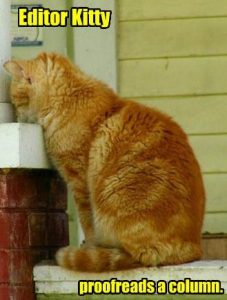
Throwing in random cat pictures that vaguely relate to your topic is fun, sure, but once again, it distracts your reader from the point.

We’ll cover what makes a table or figure appropriate and where it should be placed in a formal document in an upcoming blog post. Stay tuned!
For now, just remember: Keep It Simple with black type on a white background, a 12pt serif font like Times New Roman, and streamlined text.
Kate S.
Get a free sample proofread and edit for your document.
Two professional proofreaders will proofread and edit your document.
Get a free sample proofread and edit for your document.
Two professional proofreaders will proofread and edit your document.
We will get your free sample back in three to six hours!