We’ve talked about the content of your resume submission package: leaving stuff in and out, crafting your message to sell yourself, and cutting your content down to size.
This time around, we’ll focus on visual aspects of your presentation.
Give It Space
In a sense, we’re starting where we left off in my last column, with the task of trimming your resume to a single page. Many of our clients, I have discovered, really don’t like to cut anything. When they realize their resumes are running long, they’ll try to force in the existing information rather than make cuts. We get documents for editing with quarter-inch margins and typefaces so small you’d need a jeweler’s loupe to read them.
This all defeats the whole purpose of putting the resume on a single page, which is to make it easily readable.
Get a free sample proofread and edit for your document.
Two professional proofreaders will proofread and edit your document.
Editing for length is never easy. It takes a certain ruthlessness and a degree of confidence in the power of your remaining words. But it is necessary. If your aim is to save space, you must do so by writing concisely, not by squishing your text.
Start the editing process by making an honest assessment of the length of your document. Begin with these first steps to the best resume format:
Your document probably looks a bit longer now. In fact, you may see to your horror that it is spilling over onto a second page. That’s okay. The point of this exercise is to show you just how much you’ll need to trim. (Want help with this part? Proofreading.pal is ready!)
Don’t Fill in the Blanks
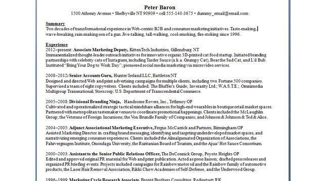
 Once you’ve got your resume lean and trim, it’s time to think about layout. There is power in white space: the power to direct your attention. A page covered top-to-bottom with closely printed text reveals nothing at a glance; it provides no guidance or signpost for the busy HR employee. A single phrase in the middle of an otherwise blank page, however, commands attention immediately.
Never forget that your recruiter will only be looking at your resume for a few moments. Help her to get the most out of it in the little time she has. Use that blank space as a navigation aid. Separating your key information with white space makes it easier to find; single-space within entries, but double-space in between.
Think Horizontally
The trick to the best resume format is using the available space to the fullest without crowding it. When you’re placing text, get the most out of the page by using the horizontal axis. The revised version of our sample resume uses a simple two-column table to present its information. In the table, I’ve used tab stops to line up company names and cities in the “Experience” section. The layout is spare and consistent; the reader always knows where to look to find the information he’s seeking.
Keep It Clean
Don’t clutter that white space. Keep decoration to a minimum. Don’t use fancy borders, text boxes, or clip-art. You can put your section headings (Work Experience, Education, and so forth) in bold, but otherwise be sparing with text effects such as italics and color. Unless you really know what you’re doing, stick with a single font throughout.
You can still add a touch of style. Just keep it understated. Think about setting off sections with a simple bar, as I’ve done below the heading. You might format the text of your headings in all-capitals or small caps, as shown in the example. Employ any graphic elements subtly; they should highlight the content of the text, not crowd it out.
When employing any stylistic flourish, keep in mind the function of the resume, and tailor the style to suit the function. Your endgame is to use space, type effects, and layout to guide the movement of the eye around the page. You’ve worked hard on your content; now make sure your recruiter can find it.
Jack F.
Get a free sample proofread and edit for your document.
Two professional proofreaders will proofread and edit your document.
Save
Get a free sample proofread and edit for your document.
Two professional proofreaders will proofread and edit your document.
We will get your free sample back in three to six hours!