
Your book is done. You’ve finished the Is and Ts, ironed out consistency issues (How did your characters end up in Luxembourg, anyway?), and had a professional editor help you get everything as polished as can be.
It’s time to push the Publish button and send your baby out into the world.
Or is it?
If your book were your child, you’d want it to go face the world looking like a million bucks, not like someone shaved a bear and put a hat on it, right?
Thought so.
That’s why you have to pay attention to formatting and presentation when you’re getting ready to self-publish. Alas, too many authors really do send out a bear in a hat. So when it comes time to self-publish your book, don’t make these five key layout mistakes.
Get a free sample proofread and edit for your document.
Two professional proofreaders will proofread and edit your document.
1. Fancy Fonts
Go to your local book haven, pick up a few books at random, and look at the fonts. Do you see a pattern?
 Professionally published books use very few fonts in their layout. There’s typically one font for the title and any chapter headings, plus a font for the main text. There might be one accent font thrown in if it’s a nonfiction book with tips sections or if the layout designer was getting kinda fancy that day.
And that main text font? It’s simple, and it’s almost always a serif font, the type that has little tails coming off the letters. That’s because this style of font is much easier to read in long passages because it lets your eyes move easily from letter to letter and word to word.
Too often, self-published authors pay no attention to this convention, proclaiming, “I can do what I want! Let’s catch the reader’s attention with something special!”
Nip that urge in the bud right now. Choosing a wacky, fancy font doesn’t make you edgy or indie. It gives your readers a headache. These fonts weren’t meant to be read over long passages; they’re for short, punchy headlines or titles.
And besides, as a self-published author, odds are most of your readers will be using a Kindle or other device. Your careful choice of Papyrus will be replaced with Times New Roman, Calisto, or Garamond. So just use it in the first place. Your readers’ eyes will thank you.
2. Too Much Text on the Page
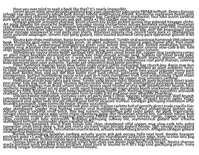
Because you pay for everything when you self-publish, there’s a natural urge to get the most bang for your buck. Many authors try to reduce their page count for the print version. But please note, this is what a 6-point font with barely any space between lines and no margins at the edges of the page looks like. It isn’t pretty.
Honestly, it doesn’t cost that much more to add a few pages—and your readers will be more likely to think they’re getting value for their money if you sell them a 370-page novel at $3.99 than if you sell them the same book formatted to have only 160 page for the same price.
3. Too Little Text on the Page
Here authors format their books so that there’s only a teeny bit of text on each page, supposedly so that they’re not distracting their readers with extraneous formatting or feeling crowded.
The problem is, there’s definitely such a thing as too much white space. This leads to a poor reader who can’t finish a whole sentence before turning the page.
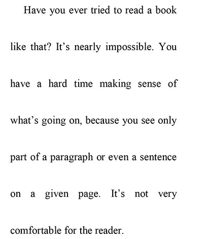
Laying out your book like this also increases the chances of having issues with what’s called “rivering,” where big blank spaces open up between your words. These big ole gaps draw the reader’s eye, pulling them out of your story and calling attention to the look of the text instead of its content.
4. Automatic Formatting
When authors don’t understand even the basics of book formatting, things can get ugly indeed.
Many self-published books go straight from word processor to “completed” file, uploaded directly to Kindle or to a print-on-demand service like CreateSpace. It’s fast to simply upload a Word file and let the proverbial “meatgrinder” take care of prepping your file for sale, but it means that you’re not ensuring your readers get a professional experience.
These direct conversions often strip all the formatting out of your book, meaning that readers get one or two very long paragraphs with no indents or breaks, no italics or other emphasis, and no way to read the darn thing but in a visual unbroken monotone.
5. Too Much Formatting
It’s best to keep things simple and streamlined with your formatting. Don’t assume that because one formatting technique is good, seven of them must be better.
Use one paragraph style: Either indent your paragraphs slightly (about 0.25”, not the 0.5” common as a default in Word) or leave a blank line in between to form block paragraphs. Don’t do both. It’ll just irritate or confuse your reader.
Take it easy with graphic breaks: It’s handy to indicate a scene break with a graphic or some wildcard characters like ***, but don’t get all fancy and don’t put it all over the place. Reserve it for when you’re doing something specific, like jumping from one time and place to a completely different time and place within the same chapter.
Know when to use drop caps: Drop caps, those big fancy capital letters, go only on the first letter of the first paragraph of the first page of each chapter. No where else.
Use one color and make it black: When you’re self-publishing, you’re usually trying to stick to a budget. Printing in color is far more expensive than printing in black and white, so much so that most indie authors shouldn’t even bother going color. For a memoir, nonfiction book, or novel, you really don’t need color anyway; you’ll probably have minimal graphics that can be rendered just as well in black and white
Even photographs and charts can still pop in B&W when done right. And again, on an e-reader it’ll probably be in black and white anyway.
If you avoid making these 5 rookie self-publishing mistakes, you’ll be able to make your book’s style just as good and professional in quality as its content.
Now get out there and publish!
Kate S.
Get a free sample proofread and edit for your document.
Two professional proofreaders will proofread and edit your document.
Get a free sample proofread and edit for your document.
Two professional proofreaders will proofread and edit your document.
We will get your free sample back in three to six hours!


© 2010 - 2020 ProofreadingPal LLC - All Rights Reserved.